The Blink Test: What Your Website Says About You in 3 Seconds
The $12,600 Lesson Phil Paid For
Phil called me after seven months and $1,800 a month in Google Ads.
The clicks were real. The traffic was real. The conversions were not.
He'd fired one agency and hired another. Both told him to be patient. Both were wrong about what the problem was.
When I finally looked at his homepage, I understood it in about three seconds. Which is exactly the point.
The site was fine. That's not a compliment. Clean layout, professional logo, decent headline, easy navigation. Phil had clearly invested in it. And it looked almost identical to 12 other MSPs in his city.
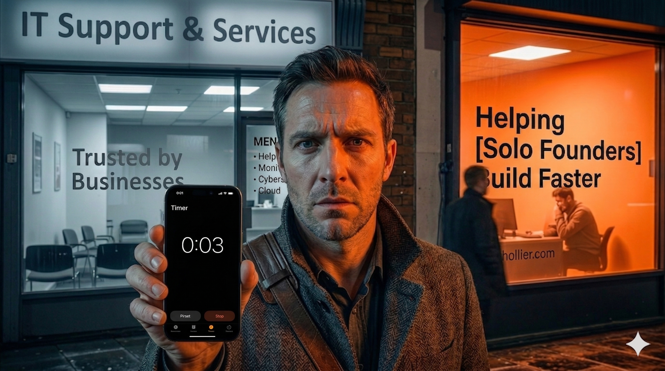
Same stock photo of a server room. Same "Trusted IT Support for Growing Businesses" headline. Same paragraph about proactive monitoring, 24/7 helpdesk, and cybersecurity. Same structure, same language, same energy.
He wasn't running a bad ad campaign. He was running a working ad campaign into a forgettable website.
Those are different problems with different fixes.
The ad sends a stranger to your homepage. The homepage has 3 seconds to answer one question: is this for me? Phil's homepage answered that question with silence. So the strangers left.
$12,600 to learn that fine is not enough.
What the Blink Test Actually Measures
The Blink Test isn't about aesthetics. You can have a beautiful website that fails it. You can have a basic one that passes. The test has nothing to do with design budget.
It comes from usability research. Studies on web credibility found that people form a first impression of a website in roughly 50 milliseconds. Before they've read a word. Before they've consciously processed anything. Their brain has already decided.
In practice, the operative window is 3 seconds. That's how long a stranger who lands on your homepage from an ad or a search result will give you before making a judgment. Stay or go. Relevant or not. For me or for someone else.
The only thing the Blink Test measures is this: in 3 seconds, can a stranger tell who you help and why you're different?
Two things. Who. And why different.
Not "do they understand your service stack." Not "do they see your pricing." Not "do they know how many years you've been in business." Just those two things.
Who you help. And what makes you different from the other tab.
Most MSP homepages answer neither.
The 5 Ways MSP Homepages Disappear
I've audited a lot of MSP websites. The same failures show up across different markets, different company sizes, different design budgets. Five of them account for almost every homepage that can't pass the Blink Test.
The Generic Headline
"Trusted IT Support for Businesses of All Sizes." This is the most common. It sounds professional. It is completely meaningless. "Trusted" is not a claim. "All sizes" is not a positioning statement. These words are placeholders for a decision that hasn't been made: who, specifically, are you for?
The Server Room Photo
Every stock photo library sells the same images to every IT company. Blinking server racks. Business professionals staring at monitors. Hands on keyboards under moody lighting. Your homepage visual signals "IT company" without signalling "your IT company." The irony: the more money you spend on a high-quality version of this photo, the harder it is to tell you apart from the MSP next door who used the free version.
No ICP Signal
If a stranger lands on your homepage and there is nothing in the first screen that names an industry, a company type, or a specific kind of problem, they have to work to figure out if you're relevant to them. They won't work. They'll leave. Generic visibility reaches nobody. Specific visibility reaches exactly the right person and makes them feel found.
Features Instead of Outcomes
"Proactive monitoring. Helpdesk support. Cybersecurity. Cloud migrations." This is a service menu. Your prospect is not shopping for services. They are shopping for relief. They want to know what life looks like after they hire you, not what's on your price sheet. "We keep dental practices running without the 2am emergencies" is an outcome. "24/7 helpdesk" is a feature. One stops a stranger. One doesn't.
No Differentiation
This is the Phil problem. The site looks and sounds like the competition. Same structure, same language, same visual style. You could swap logos and nobody would notice. This isn't a design problem. It's a positioning problem that design can't solve. If your homepage could belong to any IT company, it belongs to none of them.
The Reframe: Generic Is Not Safe
Here's the argument most MSPs make when they defend a generic homepage: "I don't want to turn anyone away. If I get too specific, I'll miss prospects."
It's understandable. It's wrong.
Generic doesn't keep your options open. Generic makes you invisible to everyone. When a stranger lands on your homepage with no specific context about who they are, they have to imagine whether you're right for them. Most won't bother. They'll click the back button and find someone who already speaks their language.
Specificity does not shrink your market. It eliminates your competition.
The MSP who says "we specialise in keeping law firms in the Chicago metro compliant and running" is not competing with every other managed service provider. They're the only obvious choice for their ICP. Every other option requires the prospect to do more work to evaluate fit.
Being generic feels like playing it safe. What it actually does is make you compete on the same terms as everyone else. And when everything looks the same, the cheapest option wins.
You don't want to win on price.
Step 2 of the 3Cs Framework: Get the Double-Take
In the 3Cs Framework, Month 1 is Stage A: Collect Leads. Step 1 is Be the Signal. That's the positioning work: defining your ICP, locking your differentiation, knowing what makes you worth noticing.
Step 2 is Get the Double-Take.
The Double-Take is what happens when your homepage makes a stranger pause. Not because it's beautiful. Not because it has clever copy. Because it's clearly for them. Their brain ran its three-second filter and got a hit.
Three elements produce a Double-Take on a homepage.
A specific headline that names the outcome and the who.
This is not "IT Support You Can Trust." It's something like: "We keep Chicago's dental practices running without the 2am emergencies." That headline names an industry (dental practices), a geography (Chicago), and an outcome (no 2am emergencies). If you're a dental practice owner in Chicago with an unreliable IT situation, you stopped scrolling. Everyone else kept moving. That's the goal.
A visual that supports the headline.
Not a server room. The environment your client actually works in. A dental office. A law firm. A financial services lobby. The visual and the headline should tell the same story. When they don't, the mixed signal breaks the Double-Take before it forms.
One proof point above the fold.
Not a certification badge. Not "serving clients since 2012." One tangible, credible result that matters to your ICP. "93% of our clients report zero major downtime in their first year." The number of clients in your specific niche. The average response time that you can claim and defend. A result they care about, visible before they scroll.
Those three elements working together create the moment. The stranger lands. They read the headline. The visual confirms it. The proof point makes it credible. And in three seconds, their answer to "is this for me?" becomes yes.
The Fishing Pond Analogy
Think about how a fishing pond works.
If you cast into a lake where every species of fish is present, you'll catch something. But you'll spend a lot of time with the wrong bait, waiting for the right fish to wander past your hook. The lake doesn't know what you want.
A specialist pond is different. You know exactly what's in there. You use the right bait. The right fish are not harder to find. They're easier. Because the pond is stocked for them.
Your homepage is a fishing pond. A generic homepage is a lake. A Double-Take homepage is a specialist pond, stocked with your ICP, baited with their exact language, promising the exact outcome they're fishing for.
Most MSPs are casting into a lake and wondering why the wrong fish keep biting.
What Phil Changed
Phil did not rebuild his site.
He rewrote his headline. Changed the hero image to show the environment his clients actually work in rather than a server room. Added one specific client result above the fold.
Three changes. One afternoon.
His conversion rate from the same ad spend doubled in the first month.
The ads were always working. The homepage was invisible. Once the homepage stopped being invisible, the math changed.
He didn't need a new agency. He didn't need a new campaign. He needed his homepage to do what it was supposed to do: make a stranger who was already on the page stop and think "this is for me."
Three seconds. That's the window. The fix doesn't have to be complicated. The willingness to be specific is.
The Move
Set a 3-second timer on your phone.
Open your homepage in a private browsing window on a different device — not the one you've been staring at for months, where familiarity has made everything invisible.
Start the timer. Load the page. When it hits zero, stop. Don't scroll.
Write down one thing: what does a stranger now know about who you help and why you're different?
Not what you think the page says. What they actually read in 3 seconds.
That is your Blink Test score. That is the gap between where you are and where Step 2 of the 3Cs needs you to be.
The rewrite follows from the answer. Specific headline. Aligned visual. One proof point above the fold.
You don't need a designer for that. You need a decision.

Andrew Moon is the founder of Orange Nomad and the creator of the 3Cs Framework — a repeatable marketing system built for MSP owners under $5M who are great at IT but struggling to find clients. Not a marketer who learned about MSPs. An MSP owner who learned marketing — the hard way.